E-mail: Password: Create an Account Recover password

About Authors Contacts Get involved Русская версия

show

Photo #38580: Papilio xuthus

Female
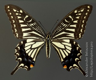
Papilio xuthus

Click image to enlarge

Base gallery. Upperside. Pinned specimen.

Photo, and identified by: Alexander Belousov. Image without retouching at the website

Date and time, location shooting/catching: 2014-07-02 00:00:00, Russia, Primorye, Oktyabrsky district, Sinelnikovo

Comments on this image

19.01.2015 23:06, Peter Khramov

And this, too. But she was not the only one.

19.01.2015 19:44, Alexander Belousov

Peter, it seems, we are referring to the same book (Les papillons du Monde. Alain Eid, Michel Viar ). Here's looking at those pictures, I decided to try the black.

19.01.2015 19:15, Peter Khramov

Firstly, I must say that, according to - Alexander, you have a pleasant and teachings foty and copies osbenno compared to that with which we here often have to deal with.
Now on the little things:
For me, as you move from the output from black to dark gray.But it is at the level of subjective Plus monitors all configured differently, so that the story is not there some kind of a guide to action, and so the view from the gallery. On occasion, pay attention, maybe something really wrong.
Svetlana, yes, black background allows even a shadow mask too.But first of all, I think it
A) Aesthetics (especially when it is necessary to emphasize the color that butterflies and other similar krasavtsiv very important).B) Lack gimor reflexes with color and white balance (especially when it is necessary to editing the main object is not affected or influenced neznachetlno background without masking this very background).
Willing to Alexander Belousov and about wear.I was guided by the galleries where not removed, biologists, photographers and, accordingly, they have no problems with the A1, and if there is, they simply squeeze the most out of the available.
As for the aesthetics and of showing sites.
Alexander (Dumchus) blindly rely on scientific sites not (all) scientific aspects are often not worth it.For example, in our subject throughout the network I do not know a single site with a decent service. Well, except ours, although it still has room to grow. With photos in scientific sites situation, maybe not such a breath-taking, but still not ideal.Do not argue, an example with black background I took from photographic albums, not from scientific but for the interference of science I do not see these pictures, but in fact even the other way around. Bo aesthetics there some aesthetics. It's just technically well-taken photos, which truncated referred to as necessary.Actually, on our website, and it would be interesting to combine scientific literacy / accuracy with a decent modern online service and aesthetically appealing illustrations.
ZY With regard to what others look - and then, to learn from the mistakes of others, rather than on its own.
Zzy Regarding the gray background - he is no. This is his plus and minus its same.I believe that for most of the photos is a minus. But back to the quality of the pictures on the site as a whole, the background color - is almost the last thing they should be changed so that they become better. As gritstsa, all have such problems: -)

19.01.2015 17:40, Irina Nikulina

And in my opinion, the most comfortable for the perception - medium or light gray. And it does not merge with the dark objects, and does not interfere with the brightness, in general - is optimal) Approximately how here http://omflies.narod.ru/tortricidae.htm But it's all very individual. As in the joke - «For whom how ..":) The main thing is that the photo copies straightened Alexander bezuprechnye- is always nice!
While distracted and hung page, Sasha about the same, and said))

19.01.2015 17:31, Alexandr Zhakov

I do not know esterika - very good when it does not interfere with scientific. But here everything is fine - and raspravka and quality, and the background. And why for someone to watch themselves need to do so that the others looked. :)))

19.01.2015 17:18, Alex Dumchus

"Prof zabugortsy often black mold." Peter. Prompt least one scientific (or pseudoscientific) zabugorny butterflies site where mold on black. Sam did some photos on black, beautiful, do not argue, but ... how could we claim to be scientific, and here aesthetics solid ...

19.01.2015 16:43, Alexander Belousov

But there are drawbacks. When shooting broken whiteflies on black, all gray and frayed become visible. Therefore, suitable only A1.

19.01.2015 16:15, Svetlana Shchavelina

:) Black background is often used to not bother with shadows from the flash. Usually it takes a piece of black velvet, it extinguishes all the shadows, very comfortable.

" I think so, too, is not bad. " is not just "not bad" and absolutely wonderful!

19.01.2015 16:15, Alexander Belousov

Shot on black, but had to reduce the processing density to dark gray. He has such a dense black that blends perfectly.
I think so, too, is not bad.

19.01.2015 15:57, Peter Khramov

If on a black background with no merge, it will be even better. Prof. zabugortsy often black mold.

19.01.2015 15:43, Svetlana Shchavelina

Beauty! Lord, take note of how advantageous looks instance on a gray background :)

Your comment

Please, create an account or log in to add comments.

Insecta.pro: international entomological community. Terms of use and publishing policy.

Project editor in chief and administrator: Peter Khramov.

Curators: Konstantin Efetov, Vasiliy Feoktistov, Svyatoslav Knyazev, Evgeny Komarov, Stan Korb, Alexander Zhakov.

Moderators: Vasiliy Feoktistov, Evgeny Komarov, Dmitriy Pozhogin, Alexandr Zhakov.

Thanks to all authors, who publish materials on the website.

© Insects catalog Insecta.pro, 2007—2024.

Species catalog enables to sort by characteristics such as expansion, flight time, etc..

Photos of representatives Insecta.

Detailed insects classification with references list.

Few themed publications and a living blog.